
How to Introduce Bold Original Art Into a Neutral Room
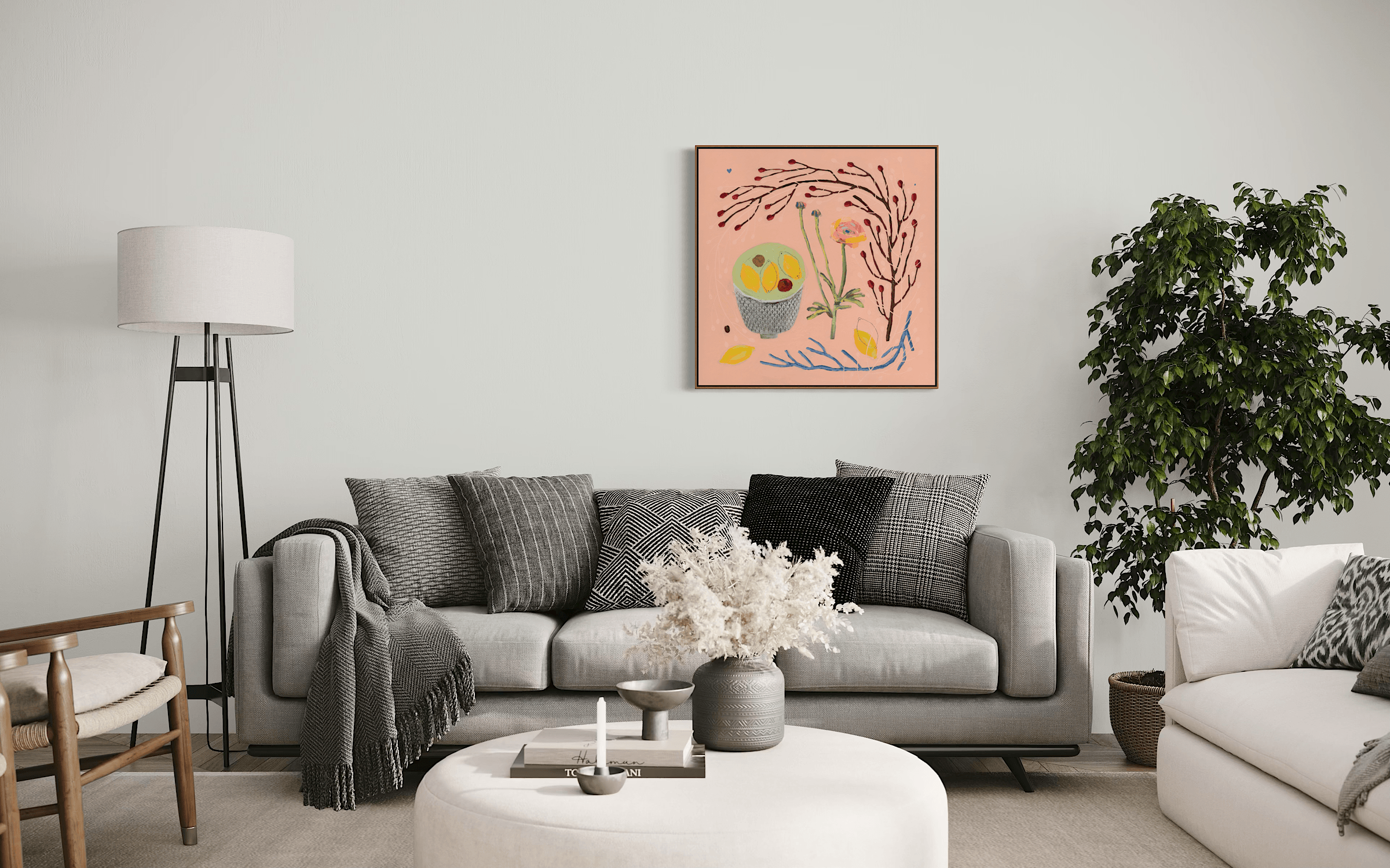
Grace and Bill (mixed media on cradled board 80cm x 80cm) adding a warm pop of colour to a neutral living space.
A specific kind of liberation comes from letting go of the need to blend in. Unless you are a self-confessed maximalist—which I most certainly am not; I favour a classic Scandinavian and Mid-Century vibe, grounded in natural materials like wood, linen, leather, and wool—it's easy to play it safe. Unless you feel completely confident with your interior styling, an easy win for years has been to stick to neutral ground. We've spent over a decade surrounded by clinical greys, flat slates, and an endless sea of safe beige in our homes.
But life is bursting with vibrant, unapologetic hues. As an artist with a background in interior design and architecture, I believe embracing colour isn't just an aesthetic choice—it's an act of pure joy and the ultimate antidote to the greige.
From Studio to Wardrobe: Where Art and Life Intertwine
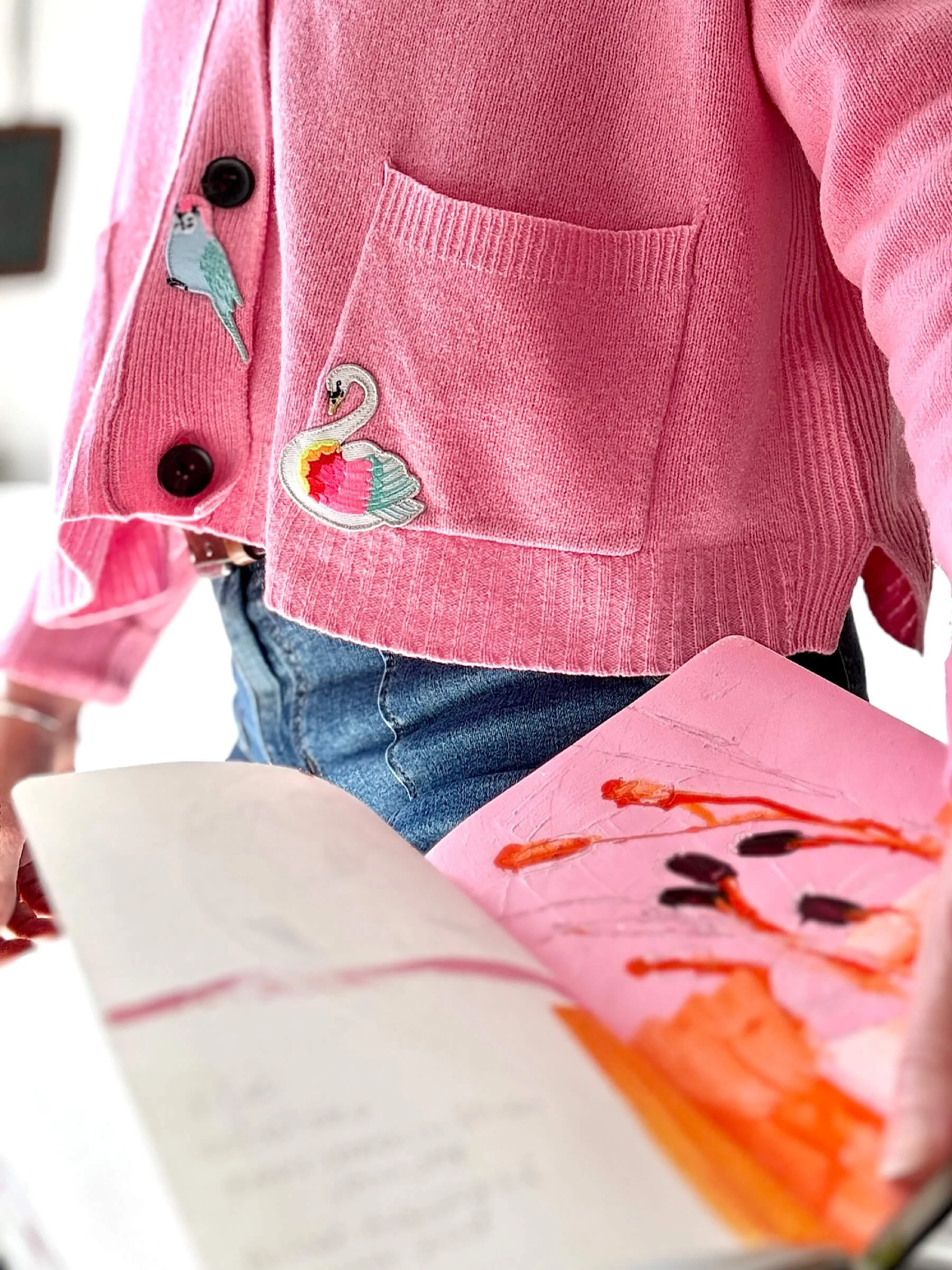
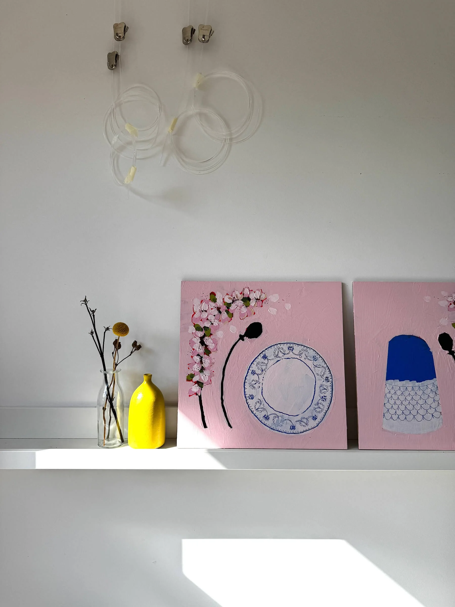
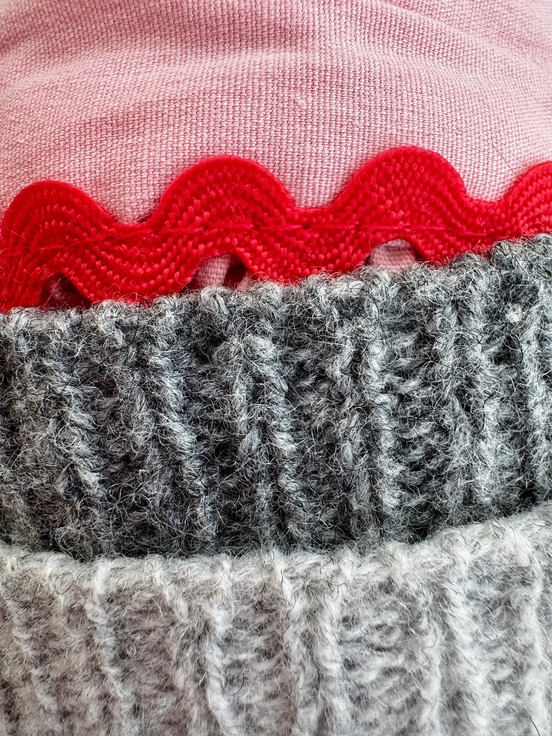
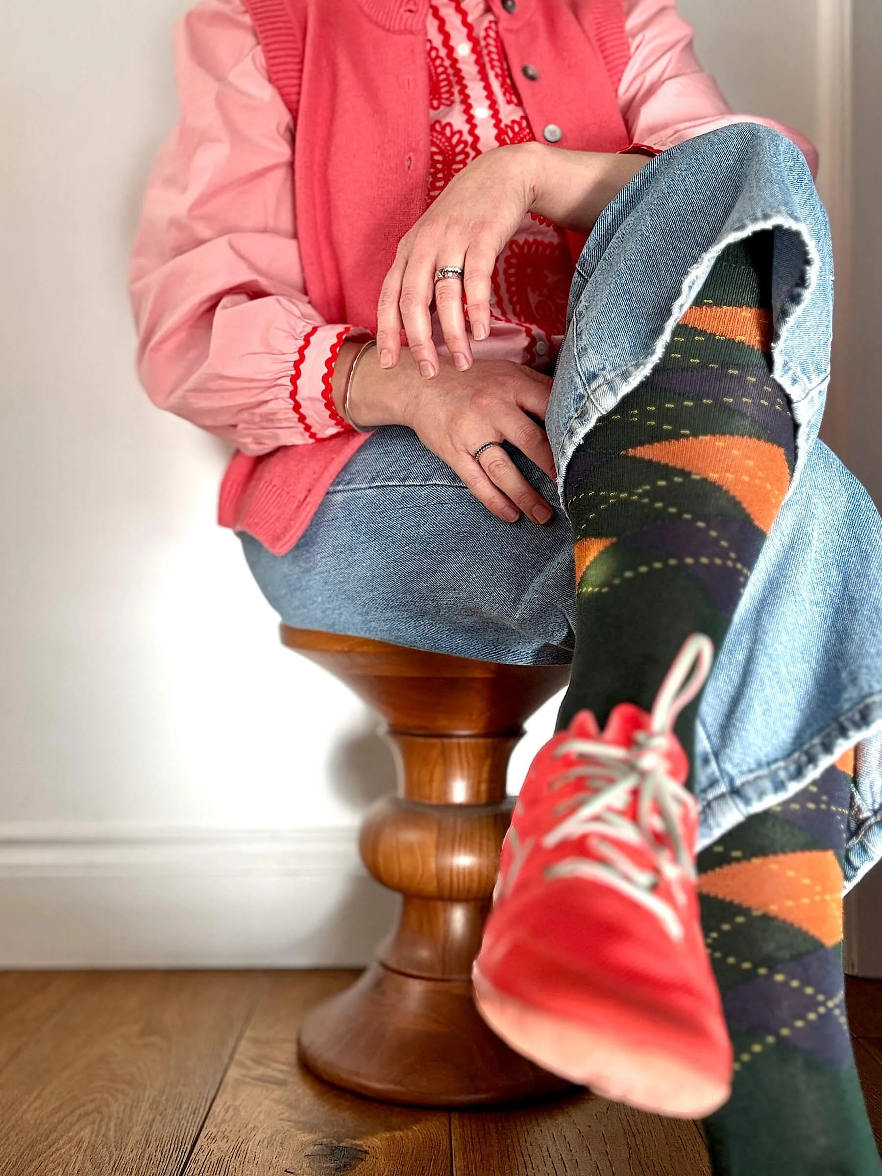
I often notice that the colours living on my easel during the day have a cheeky habit of showing up in what I wear. On days when I'm layering soft pinks on pink in the studio, I find myself reaching for those exact tonal shades in my wardrobe. Other weeks, it might be a sudden pull towards deep greens paired with a flash of energetic chartreuse.
It makes complete sense when you think about it. When you spend hours immersed in a specific palette—testing how two unexpected shades sit side by side on a board—those visual conversations stay in your mind. Choosing what to wear becomes a direct extension of that same creative process. The wardrobe is simply the easiest, most immediate bridge where art and daily life become intertwined.
When you start trusting your eye with colour in one area of your life, it spills over into everything else. Stepping away from flat greys in how you dress makes it so much easier to welcome that same playful, confident energy onto your walls.


The Impact of Colourful Abstract Art on Interior Spaces
In the studio, colour is my primary language—and I explore it through harmony. When I paint, I think about the specific emotions I want a piece to evoke in a space. Even when colours feel completely distinct, like that deep green I mentioned paired with a zesty chartreuse, if they come from the same colour family, they will inherently speak to one another and sit together in harmony; that natural balance is what brings such a unique, intentional impact to a home.
BRIGHT, thoughtful art changes how a room feels:
It Shifts the Energy:
In a soft, quiet space full of warm timber, leather, and muted tones, a sudden, unexpected pop of luminous colour acts like a shot of adrenaline—waking the whole room up without overwhelming its calm foundation.
It Tells a Story:
Colour evokes memory. A specific shade can transport you back to a place you've loved or remind you of a moment where you felt refreshed, energised, or wonderfully calm.
It Celebrates Texture:
When bold colour harmonies are paired with expressive line work and rich layers of history built up on a board, the artwork becomes a vibrant, living focal point rather than passive decoration.

Three Ways to Style Bold Art in Neutral Interiors
If your home currently sits in a comfortable neutral palette and you're feeling a bit hesitant about leaping into vibrant shades, here is how to start:
Start with the Details:
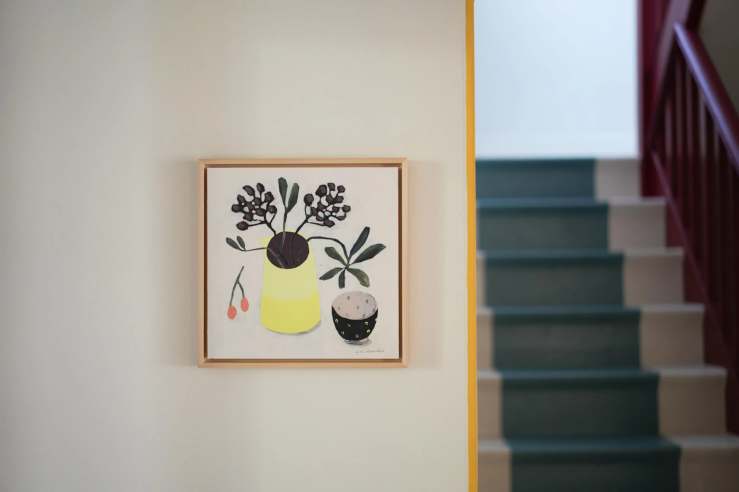
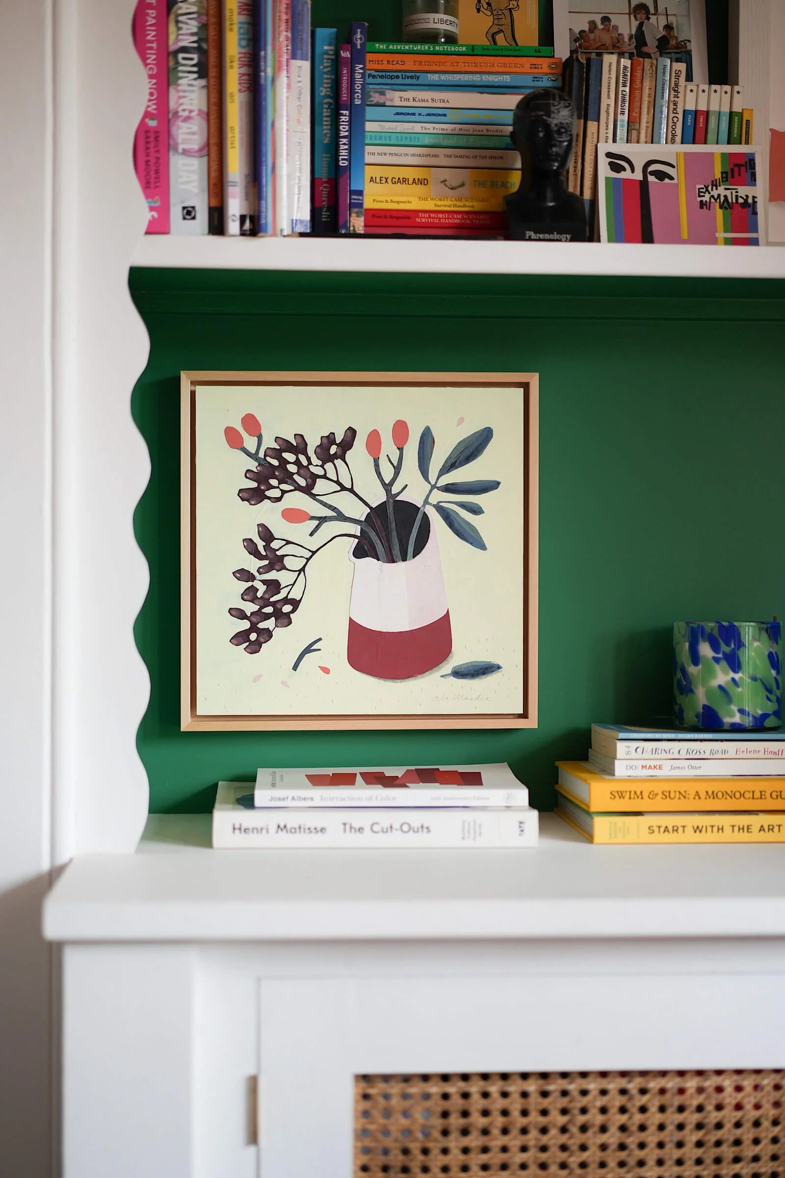
You don't need to paint an entire wall fuchsia—in fact, I would strongly recommend against making any rash colour decisions! Instead, bring these punchier colours in small pockets. Jewel-toned original still-life pieces act as a beautiful anchor; a bunch of flowers in bright graphic jug displayed alone on a wall can quietly ground those colour into the room.
Layer Your Textures:
Pair the rich, matte finish of an original painting on board with tactile elements already in your space—a velvet cushion, a plaid throw, or a glossy ceramic vase. Mixing these subtle differences in surface, texture and sheen creates true visual intrigue.
Trust Your Instincts:
Pick the shade that makes you feel something rather than following fleeting design trends. If a particular indulgent green or warm red brings you energy, that's the piece that belongs on your wall. Always be true to yourself—the more you make these intentional decisions about what you love and what you don't, the more confident you will become at choosing special things for your home.
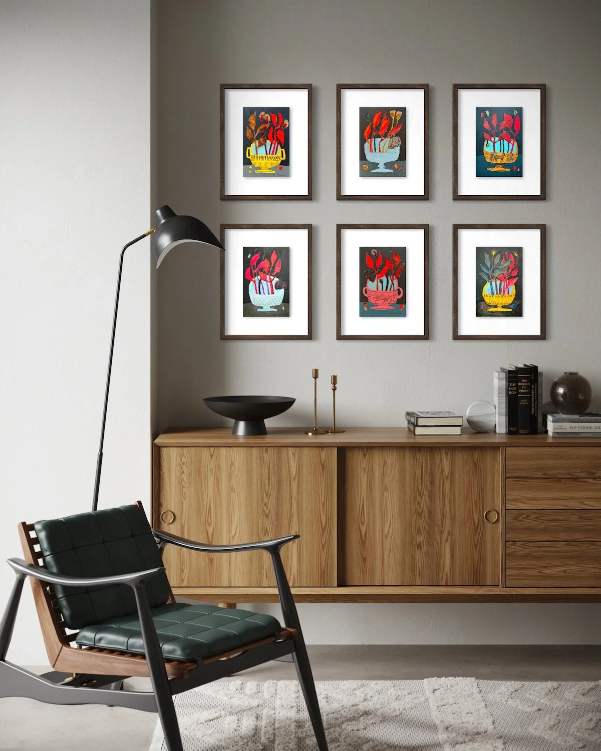
Posy Dishes Collection—a set of six small, framed original paintings on board arranged in a grid above a mid-century credenza, bringing rich, vibrant energy to a neutral wall.
Bringing It All Together
That's why BRIGHT, contemporary artwork sits so effortlessly in a neutral home. When you pair clean Scandi lines, rich wooden furniture, and tactile natural textiles with a sudden, intentional pop of luminous colour, the whole space wakes up. You don't have to surrender the calm, minimalist foundation you love to have a home full of life and personality—a single vibrant original painting is often all it takes to complete the story.
Ready to Bring More Joy Into Your Home?
Join BRIGHT News: Sign up for BRIGHT News for a regular dose of colour inspiration, behind-the-scenes studio updates, and first dibs on my latest original collections.
Explore Original Paintings: Browse current original paintings on board and find the perfect, joyful colour story for your space.